Personal Artwork
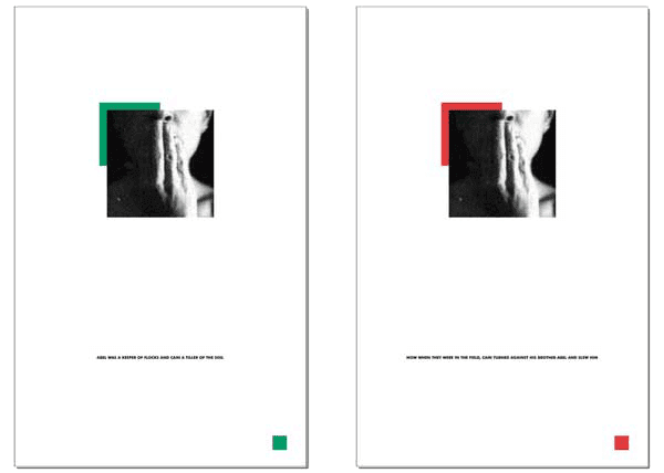
“In the Field”
A bibliographical response to power and politics in higher education. 1998. Diptych, two giclee prints on Reeves BFK, 30″ x 20″
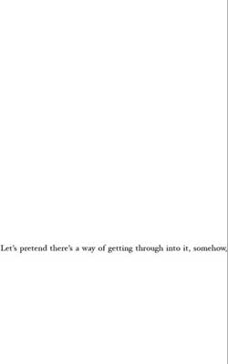
“Through the Looking Glass”
A Conceptual installation at Suzanne Emberg Usdan Gallery, Bennington College July Program Faculty Exhibit, Bennington VT. Excerpts from Lewis Carroll’s “Through the Looking Glass” on white paper are alternated with excerpts from St Paul’s Letter to the Corinthians. This gallery installation has 63 separate sheets of white copier paper with text, each 11″ x 6.5″ covered with tracing paper—to symbolically act as a shield, and which can be lifted by the viewer—clear-pushpin-tacked at each upper corner in one long row to a wall in sequential order. This piece continues the theme of responding to suppression; here, suppression of thoughts and beliefs. 2001.
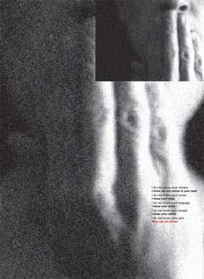
“Why I Do Not Know?”
My contribution to “Absence and Presence,” 98 printmakers’ collaborative response to the bombing of the Al-Mutanabbi St. Book Market. “These 100 works of art form a testament to the vital role of the arts, literature and culture, and their enduring importance in preserving social justice in the face of violence and terrorism” (from Exhibit Announcement, Harbor Gallery, University at Massachusetts Boston 2017). This exhibit is part of “Al Muttanabi Street Starts Here” which is touring worldwide. 2015. Giclée print on Reeves BFK, Edition of six, 15″ x 10″

“Untitled, AKA ‘Renew’”
This piece continues my explorations with text/image juxtapositions. The child sees with innocence; the adult reacts to seeing after the loss of innocence. The small image and text on the large expanse of white force the viewer to closely interact with this piece. Giclee print on Reeves BFK white. 2020. 22″ x 28″
Artist Books
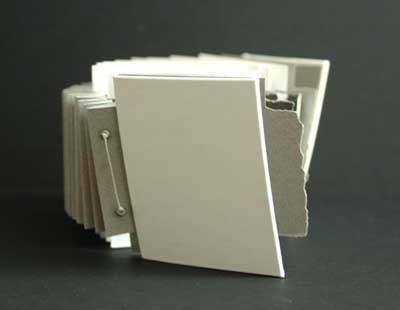
“Rejoices with The Truth”
The first artist book I made, at a Summer workshop where I learned to experiment with concertina binding, in Kingston MA. I brought my exploration of text-image juxtapositions—that I had been working on since the early ’90s in graduate school—for the first time out of flatland. In addition to exploring text and image, I explored ratio and shape interrelationships. 2006. 4 1/2″w x 4″h x 8″d. White linen book cloth, Canson Mi-Teintes paper laser printed and manually torn, with wintergreen oil-transfers of inkjet-printed photographs, linen binder’s thread and glass beads.
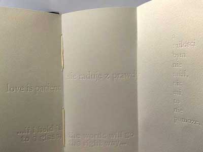
“Little Black Book”
Purely with embossed text, the pages of this book further my explorations with ratio, shape, space, and what it means for a book to follow a sequential order. Text from St Paul’s Letter to the Corinthians is interspersed with text from Lewis Carroll’s “Alice Through the Looking Glass,” in two languages (my native language, and the language of my heritage). 2008. On most pages, an overleaf conceals parts of sentences, when opened the entire sentence imparts a different/alternate meaning. Overleaves open in different ways, encouraging reader interaction. 2008. 3.5″w x7″h x5″d, suede cover over Arches Text Wove sheets, coptic bound with linen binder’s thread. All text letterpress: Franklin Gothic and Centaur typefaces.
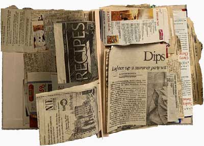
“Diary of an Immigrant’s Daughter”
Pages are Mom’s recipes I found 2013 while helping her move to Senior Housing. They struck me as cultural propaganda: ‘buy this cake mix,’ ‘use this flavouring,’ ‘shop at this grocery store’ and…voila—no longer the daughter of an early 20th-century Eastern European immigrant, you are one of us, a fully-integrated American housewife! 2014 and 2021. 6.25″w x 9.25″h x 2″d, linen book cloth over book board, concertina binding stitched with glass beads, actual recipes Mom tore and cut from magazines and newspapers; label on cover is what Mom had on the bag that held this stash of recipes.
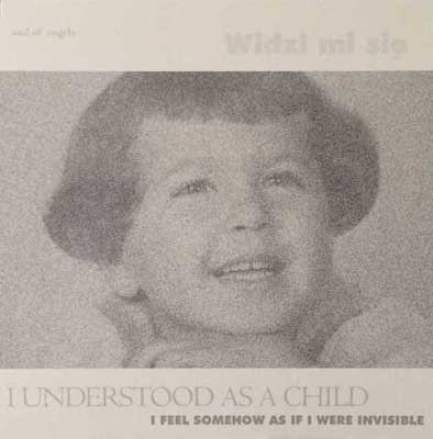
“Ago”
A commentary on the erosion of trust. 2015. “Alice Through the Looking Glass,” Lewis Carrol, 1871; St Paul’s Letter to the Corinthians 1/13, “Widze mi sie” (It appears to me) http://polishslavic.pitt.edu/polish (retr 15.09.2015); Canson Edition, Canson Mi-teintes, Fabriano Drawing, Strathmore Tracing 300 Series; Centaur MT Regular and Bold and Futura BT Extra Black typefaces; printed on HP Photosmart Plus 8210 Series; stitching is unbleached linen binder’s thread, and cotton embroidery floss is woven into the binding holes and strewn in frays alongside the binding edge to simulate the fraying of words when their meaning is eroded.
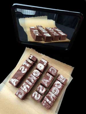
“Looking-Glass Book”
Mom’s Holiday Chocolate Fudge Recipe, with individual letters incised and cut, and dusted with confectionary sugar, mirror-image to simulate metal type. Reflected here in a mirror to reinforce—and to help gallery viewers read—the title. 2017. This playful piece—each ‘block of type’ approx 1″ x 1″ x 1.25″—was designed and made for an edible book exhibit, in which it won the award for “Tastiest” entry. Definitely not archival, devoured by exhibit patrons 🙂
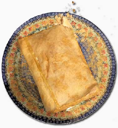
“Bibliophyllo”
Designed for an edible book exhibit, in which it won the “Most Book-Like” award. Not archival, simply yummy! 2019. Phyllo dough ‘leaves’ simulate pages in this medieval-proportions*-inspired ‘book’ which was baked, ‘bound’ with caramel (butter and brown sugar), and sprinkled with gold food-grade sparkle dust. 12″ x 8″ x 2″ to approximate the *Golden Ratio (the proportion of many [most?] medieval and Renaissance books).